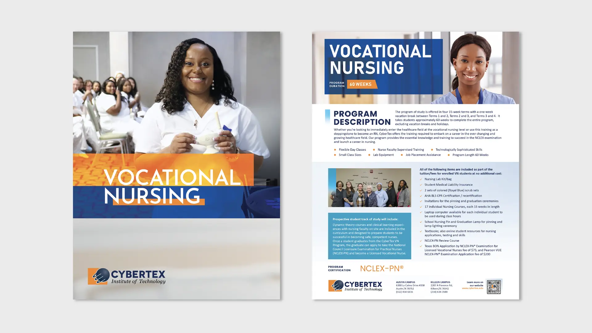
Cybertex Branding Print Solutions
From folders to fabric — a full-spectrum print marketing design experience for educational institutions.
Task
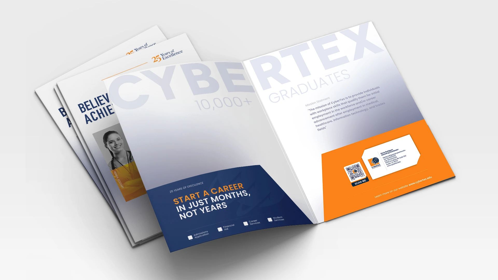
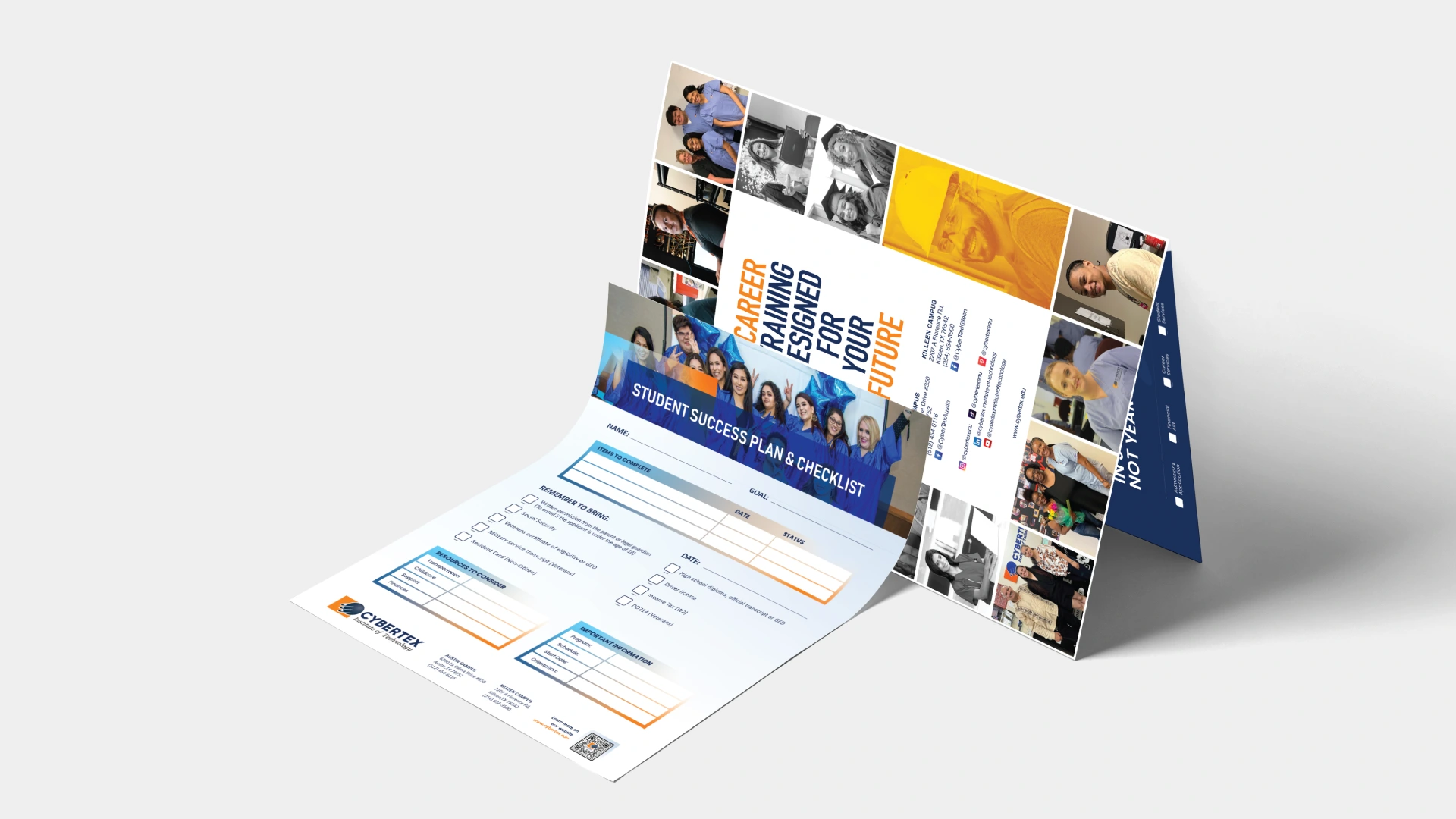
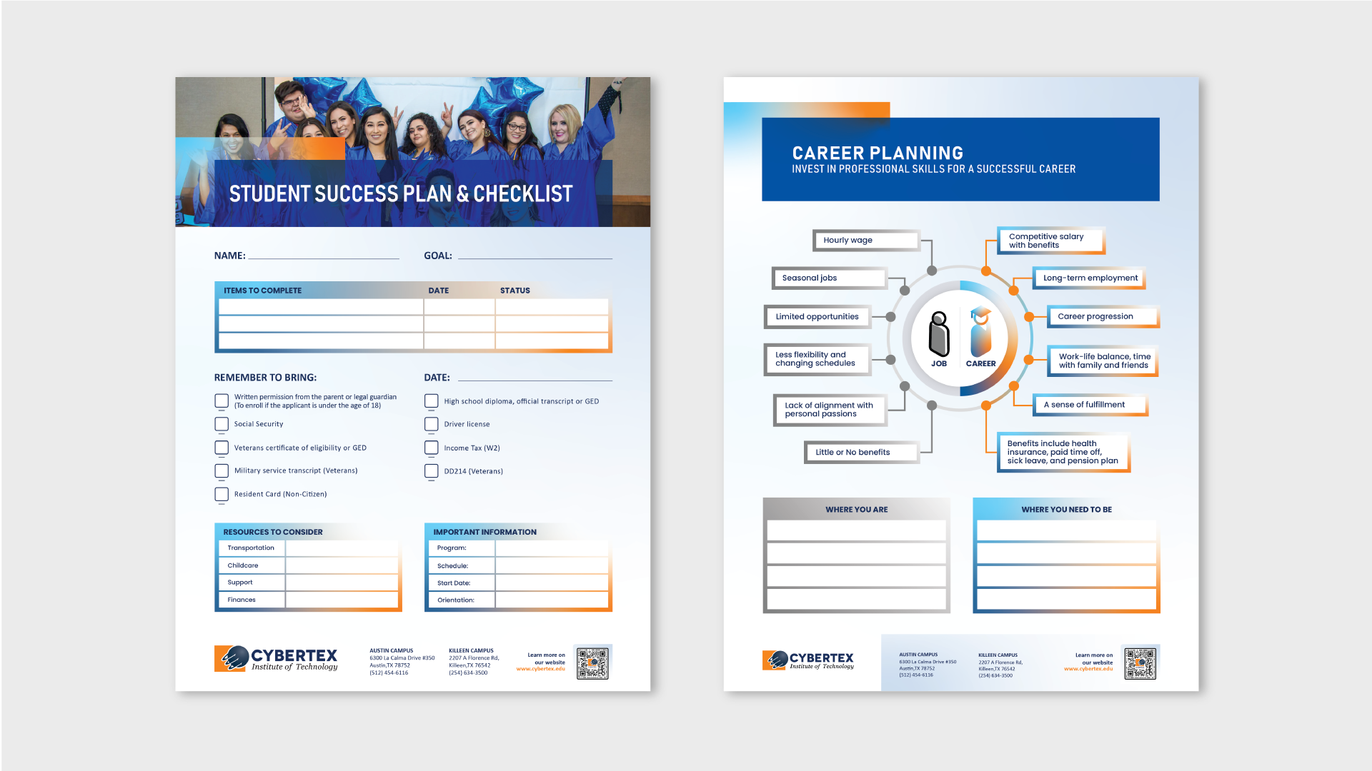
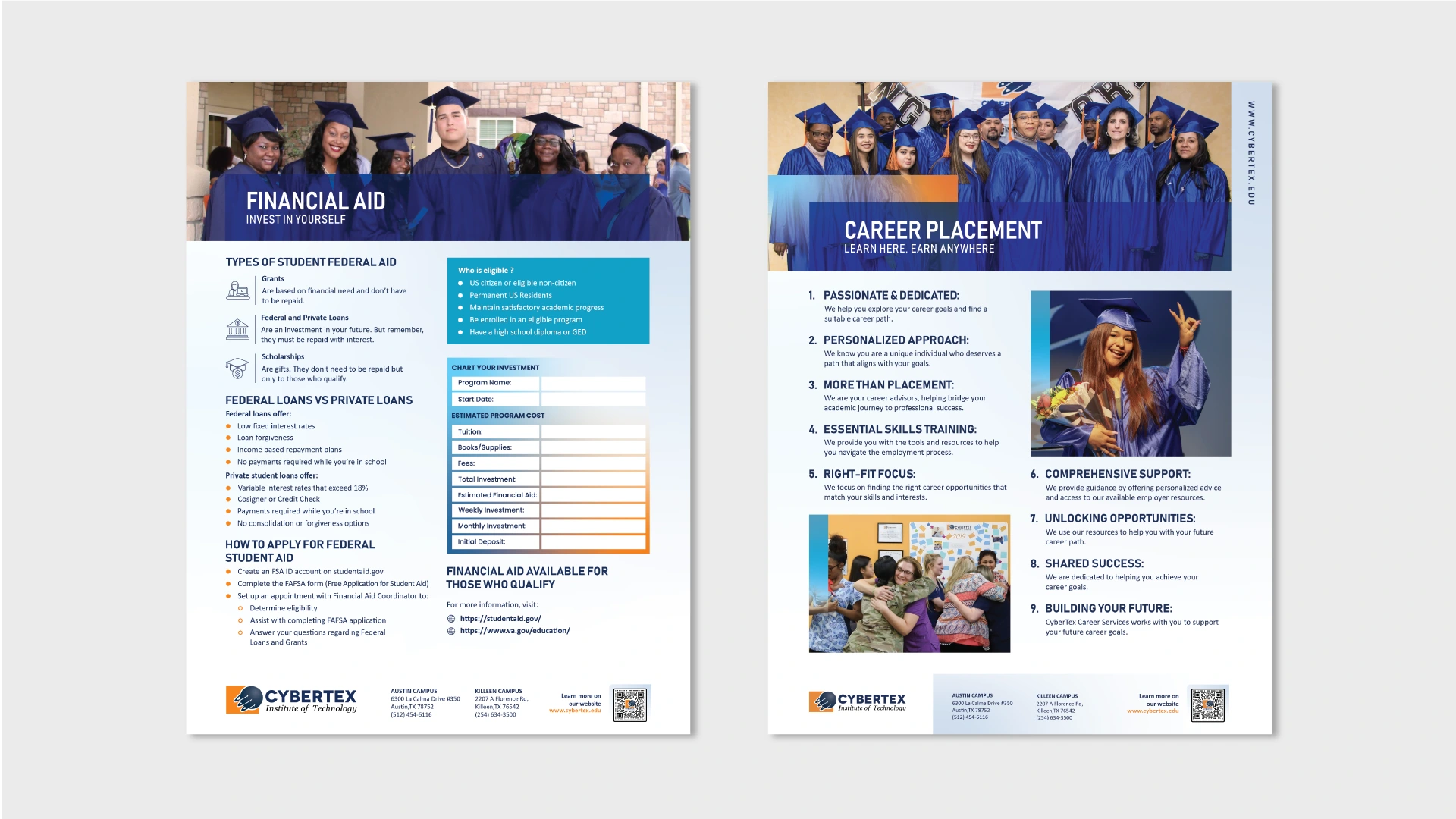
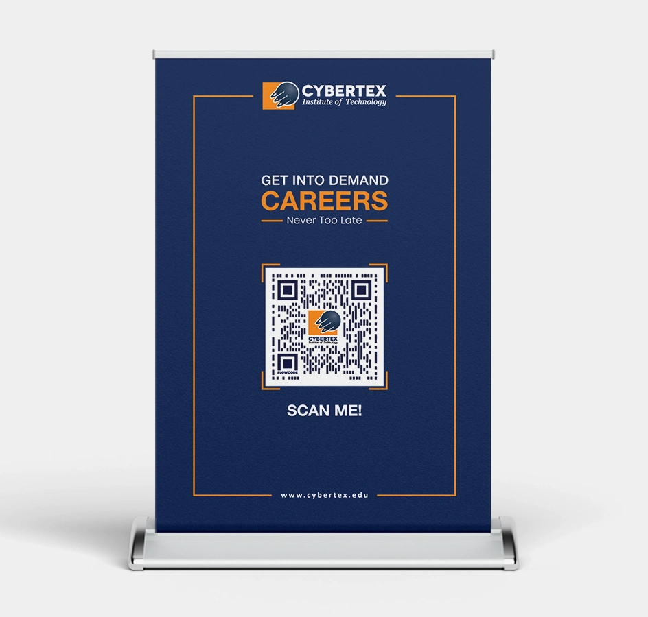
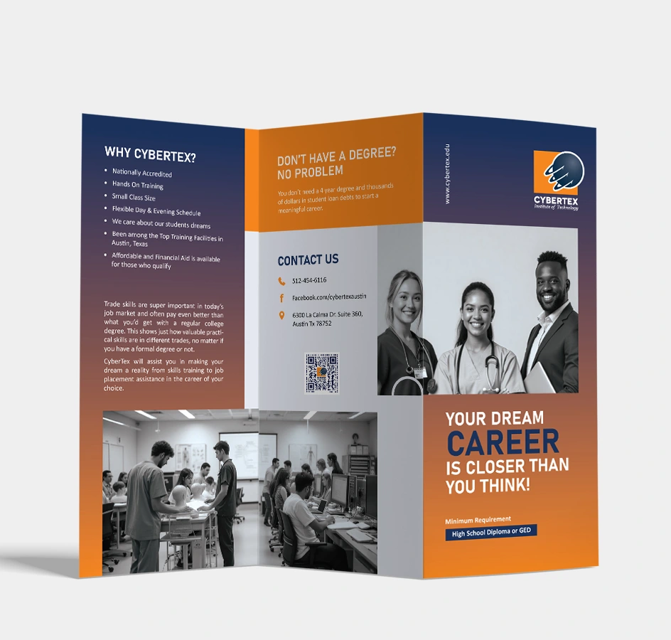
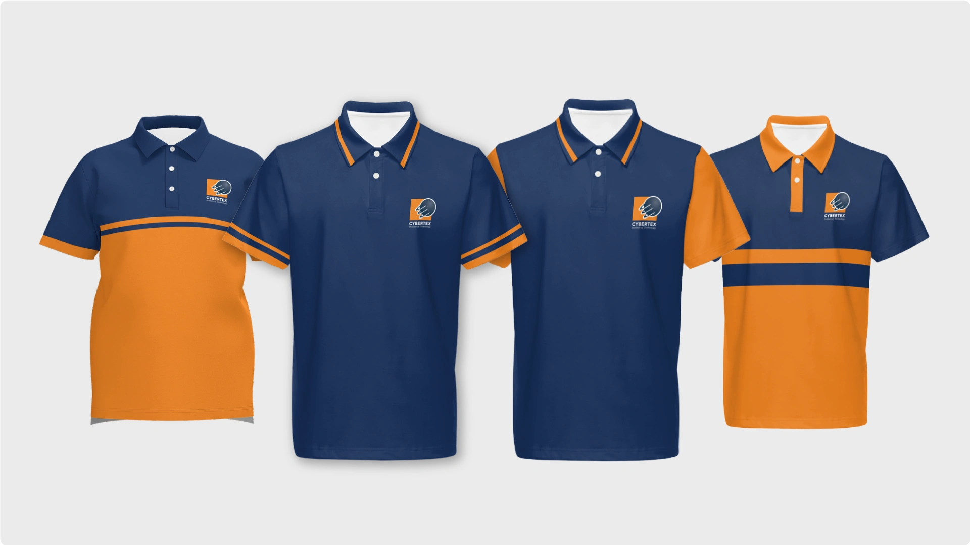
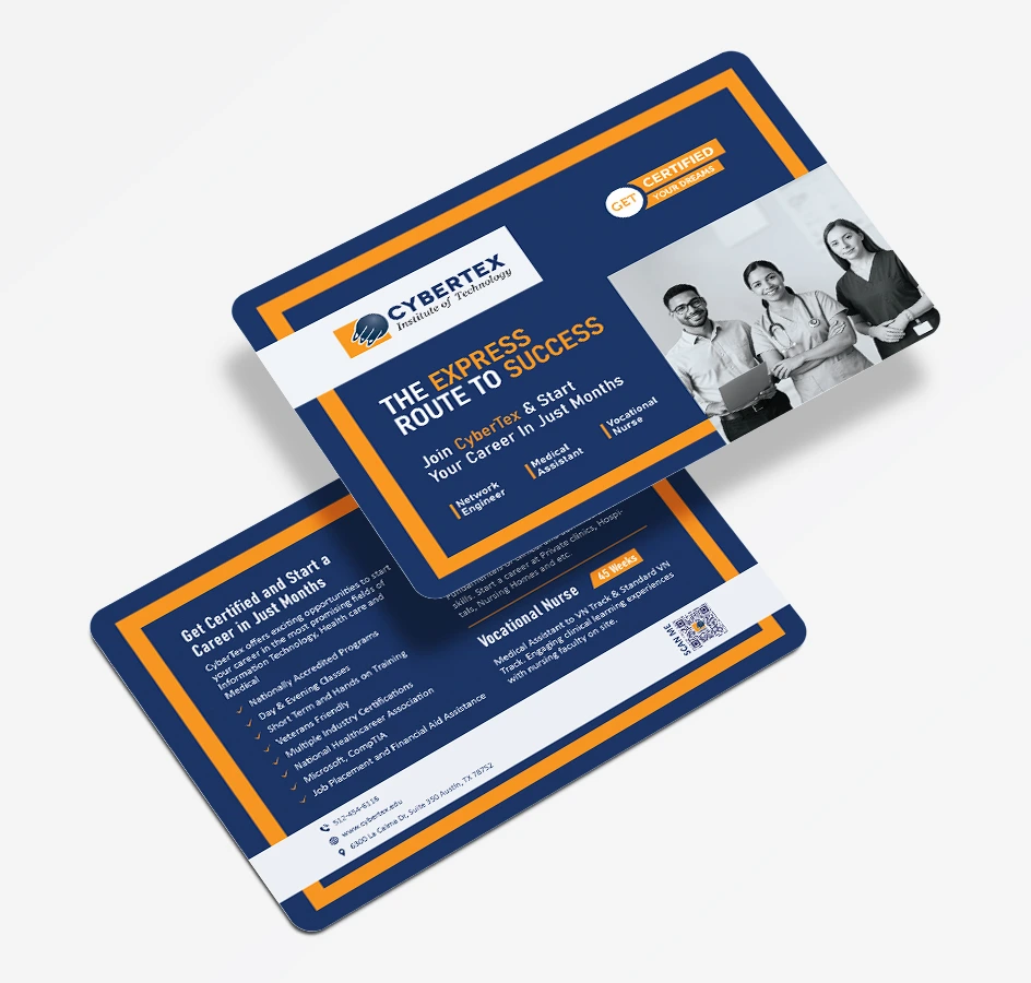
CyberTex, a career training institute in the U.S., required a cohesive and professional set of custom-designed marketing materials to enhance its brand presence at student recruitment events and campus outreach. The objective was to deliver a complete suite of print design assets — including presentation folders, informational inserts, trifold brochures, booth tent graphics, custom table covers, branded T-shirts, and tabletop banners — that would clearly reflect CyberTex’s mission, engage prospective students, and establish a recognizable brand across all print and event branding touchpoints. The challenge was to maintain consistency and clarity across diverse print formats while ensuring every element met production specifications and adhered to the institute’s branding guidelines.
A major challenge was creating layouts that maintained clarity and hierarchy of information, particularly for brochures and inserts that guided students through program choices. Additionally, aligning print color accuracy across paper, vinyl, and fabric involved detailed setup for folds, bleeds, and alignment.
Translating CyberTex’s digital identity into tangible print assets for educational events meant adjusting contrasts, scales, and storytelling to work across booths, apparel, and printed formats. Every deliverable was part of a larger, cohesive visual branding system.
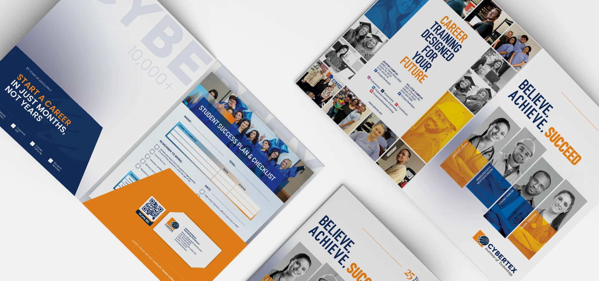
The resulting print design system successfully aligned with CyberTex’s mission and their career-focused educational services. Through collaborative work with the client’s team, the content and visuals were structured to be both informative and inviting.
Color consistency, professional typography, and messaging played a key role in establishing a strong on-campus and off-campus brand identity — particularly at career fairs, outreach events, and promotional activities.

|
Primary #1F2F58 |
SCSS var $color-Nile Blue |
◯ |
| R 31 G 47 B 88 |
Nile Blue
|
Secondary #171B44 |
SCSS var $color-Blue Zodiac |
◯ |
| R 23 G 27 B 68 |
Blue Zodiac
|
Secondary #E5E7EF |
SCSS var $color-Lavender Mist |
◯ |
| R 229 G 231 B 239 |
Lavender Mist
|
Secondary #E78B3C |
SCSS var $color-Cadmium Orange |
◯ |
| R 231 G 139 B 60 |
Cadmium Orange
Typefase
POPPINS
Poppins is one of the new comers to this long tradition. With support for the Devanagari and Latin writing systems, it is an internationalist take on the genre.
Usage
Headings & Paragraphs
Weight
Bold/Medium/Regular
Heading 1
Heading 2
Heading 3

Management
Stacey Grey
Brand Research
John Stamper
Project Manager
Colin Mondero
Account Manager
Art Direction
Stephen Miller
Creative Director
Sarah Rickson
Brand Strategy
Production
Melissa Macaya
Graphic Design
Mark Caldwell
UI/UX Desing
