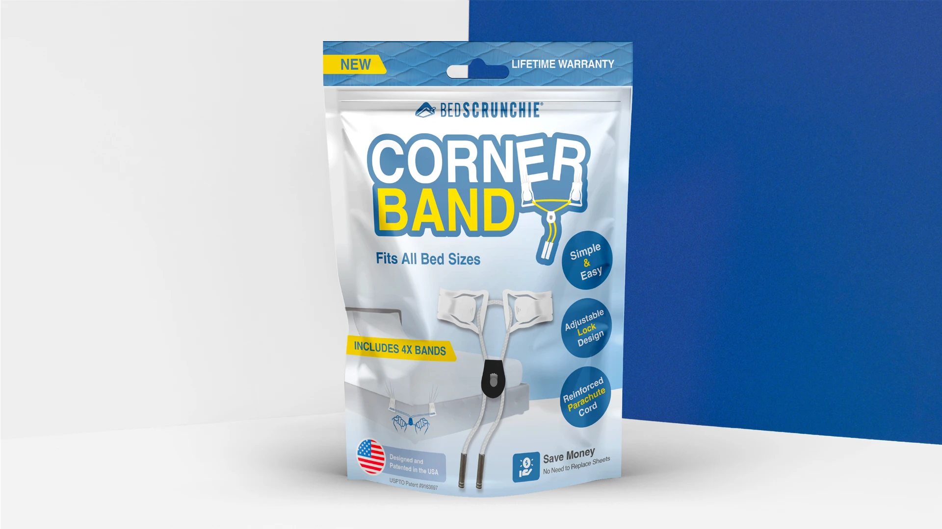
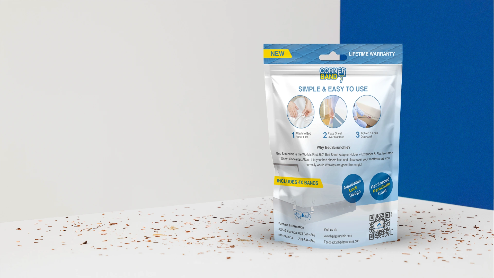
Bedscrunchie: Innovative Packaging for the World’s Smartest Bedsheet Solution.
Turning comfort into a design language — Graphic Design and product packaging design crafted to elevate Bedscrunchie’s brand identity.
Task
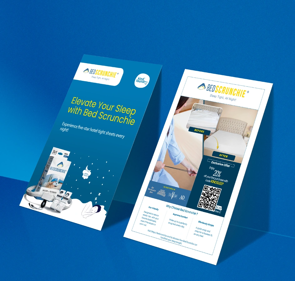
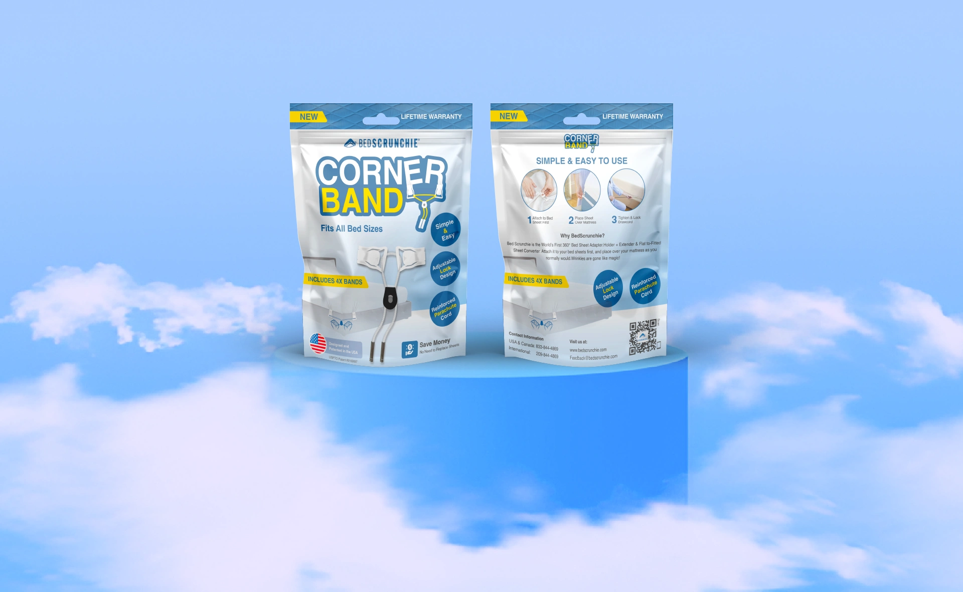
Bedscrunchie, a premium bedding accessory brand, required a cohesive and visually compelling product packaging design system to strengthen its retail presence and communicate its unique product value to customers. The objective was to create a complete set of packaging assets, including retail boxes, insert card design, and product illustration that would highlight Bedscrunchie’s innovation, emphasize comfort and quality, and stand out on store shelves. The challenge was to ensure consistency and brand recognition across multiple packaging formats while maintaining clarity, premium appeal, and production-ready precision in every design element.
A major challenge was designing packaging layouts that balanced clarity with strong visual hierarchy, particularly for product sleeves and insert card design that explained Bedscrunchie’s features and usage. Additionally, ensuring consistent color accuracy across various materials, from retail boxes to printed inserts and shipping elements, required detailed setup for folds, bleeds, and production alignment.
Translating Bedscrunchie’s brand identity into tangible packaging meant carefully adjusting contrasts, scales, and lifestyle-driven storytelling to work across retail packaging, inserts, and unboxing experiences. Every element was crafted as part of a larger, cohesive product packaging design system that reinforced the brand’s premium comfort and innovation.
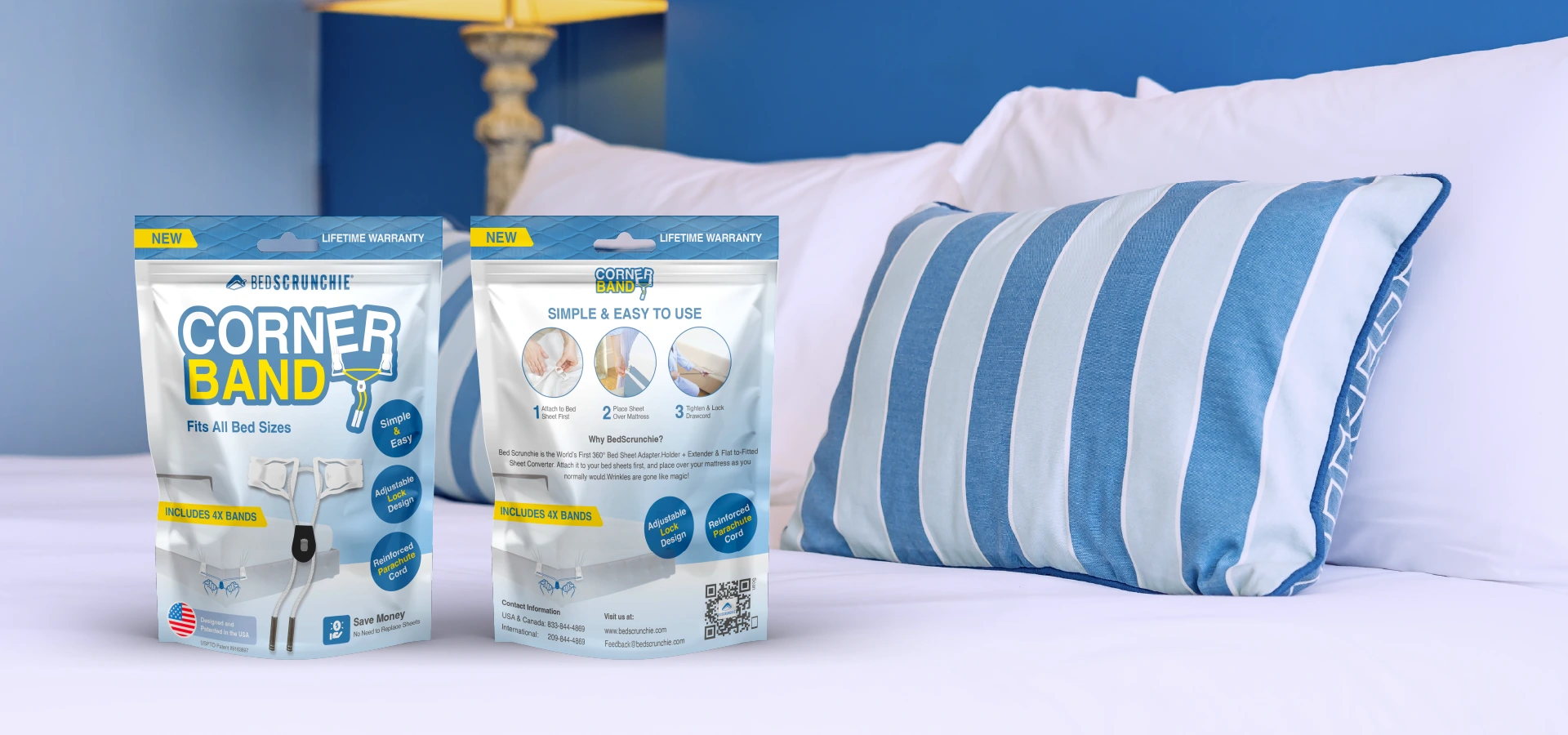
The resulting product packaging system aligned perfectly with Bedscrunchie’s mission of delivering comfort through innovation.
Premium typography, consistent color usage, and lifestyle-focused messaging strengthened Bedscrunchie’s retail and e-commerce presence, from the moment a customer spots the box to the final unboxing experience.

|
Primary ##3E6997 |
SCSS var $color- Queen Blue |
◯ |
| R 3 G 108 B 157 |
Queen Blue
|
Secondary ##6AB5E1 |
SCSS var $color-Sky Blue |
◯ |
| R 106 G 181 B 225 |
Sky Blue
|
Secondary ##F8DA06 |
SCSS var $color-Gold |
◯ |
| R 255 G 213 B 0 |
Gold
|
Secondary ##FFFFFF |
SCSS var $color-White |
◯ |
| R 255 G 255 B 255 |
White
Typefase
POPPINS
Poppins is one of the new comers to this long tradition. With support for the Devanagari and Latin writing systems, it is an internationalist take on the genre.
Usage
Headings & Paragraphs
Weight
Bold/Medium/Regular
Heading 1
Heading 2
Heading 3
Management
Stacey Grey
Brand Research
John Stamper
Project Manager
Colin Mondero
Account Manager
Art Direction
Stephen Miller
Creative Director
Sarah Rickson
Brand Strategy
Production
Melissa Macaya
Graphic Design
Mark Caldwell
UI/UX Desing

